 You are viewing an old version of this page. View the current version.
Compare with Current ·
View Page History
You are viewing an old version of this page. View the current version.
Compare with Current ·
View Page History
Label panel
What is a label panel?
A label panel is generally used to "label" areas of your display board, but also to add the current date and time or an image, such as your company logo.
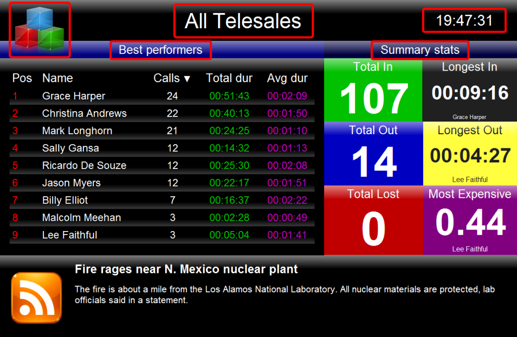
The following example shows how label panels - highlighted in red - look on a display board. A large label panel, All Telesales, is shown at the top of the screen, followed by two smaller label panels Best Performers and Summary Stats, describing the sections below them. Another two label panels were also used to add the company logo, at the top-left of the page and the current date and time at the top-right of the page.
 | There is no limit to the number of label panels you can use on a display board, e.g. you may choose to add a large label panel at the top of the board and smaller label panels on subsections. |
Adding a label panel
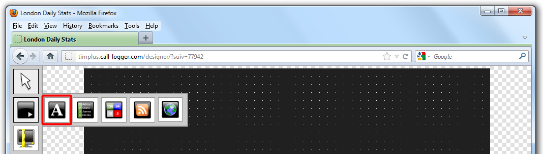
To add a label panel, click on the  button and then select the
  button, as shown below:
The list of available panels types will disappear and the mouse pointer will transform in a white, cross-like pointer sign indicating where your panel will begin. Simply drag your mouse across the screen and you can size the panel as shown below:

Customising a label panel
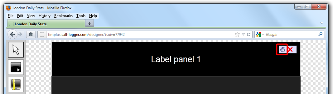
To customize your label panel, click on the  button on the top-left corner of the screen, then select the
  icon to customise the panel, as shown below:
The following screen will appear:
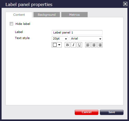
Content
Enter the name you would like to appear on the label, then choose the style of font you would like to use for your header as well as the font size, by selecting from the drop-down list.
To select the text colour, click on the drop-down arrow as shown below. This will show the colour palate available. To select a standard colour, all you need to do is click on it. To add a custom colour, click on one of the blank custom colour squares and type in the RGB colour codes to add to your custom palette.You will need to click on thebutton to set the chosen color.
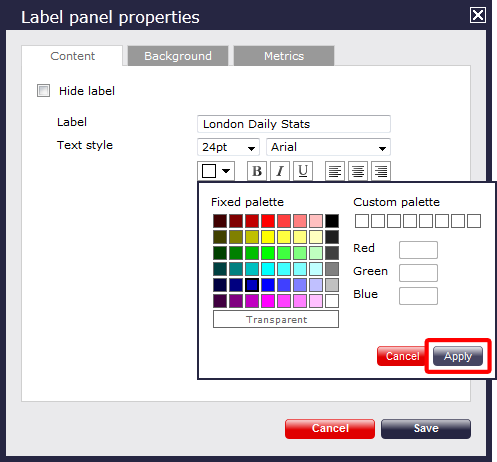
If you would like the text to appear as bold, italic or underlined, simply click on the required box to highlight  .
.
To determine the placement of your title, simply click on  .
.
At the end, click on thebutton to save any changes made.
Background
Click on thetab to configure the properties for the background of your label panel.
If you would like to add an image source, simply type the details in the box provided, as shown in the sceenshot below, otherwise leave blank. You can decide to repeat the image or centre it on the panel, by selecting from the drop-down list of the Image style field.
To select the background colour, click on the drop-down arrow; this will show the colour palette available. To select a standard colour, all you need to do is click on it. To add a custom colour, click on one of the blank custom colour squares and type in the RGB colour codes to add to your custom palette. You can also pick a transparent background, if you prefer. You will need to click on thebutton to set the chosen colour.
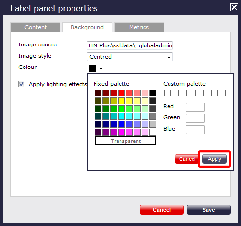
If you would like to apply lighting effects to the label panel, just tick the box as shown here:

The two examples below show the difference between panels with and without lighting effects. The panel with the slight shine has a lighting effect applied, while the solid black panel has no lighting effects.

Metrics
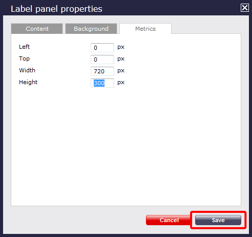
To define the panel's metrics to suit your particular screen, simply type the required pixel sizes in the boxes provided, then click on thebutton to save any changes made.
Label panel - overview video
For a live demonstration on how to design and customise a label panel, watch the video below: