 You are viewing an old version of this page. View the current version.
Compare with Current ·
View Page History
You are viewing an old version of this page. View the current version.
Compare with Current ·
View Page History
Summary panel
What is a summary panel?
Summary panels are normally used to display a summary of information (e.g. the longest call, the most expensive call, the total number of inbound calls etc.)

Adding a summary panel
To add a summary panel, click on the  toolbar button to expand the list of panel types and choose the
  button, as shown below:

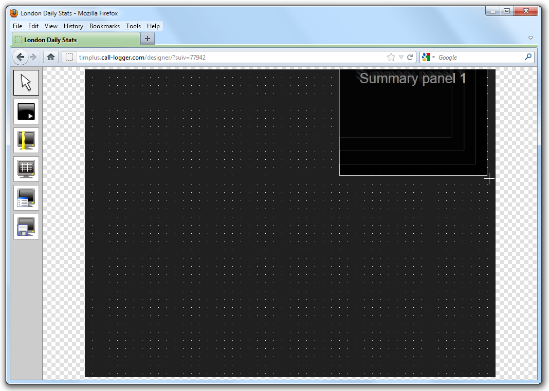
After selecting the summary panel button, the mouse pointer changes into a white crosshair pointer, indicating that the designer is ready to draw your panel. Click and hold your left mouse button, starting at the point defining the upper-left corner of your new panel. Whilst still holding down the left mouse button, drag the marquee that will appear to the point that will define the lower-right corner of your panel, as shown below:
Customising a summary panel
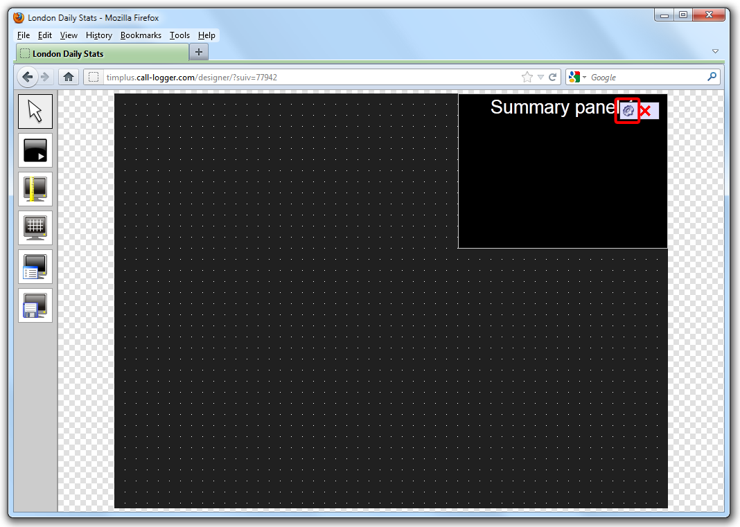
To customize a summary panel, click on the  button on the top-left corner of the screen, then select the
  icon to customise the panel, as shown below:
The Summary panel properties window will open, containing the following tabs:
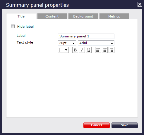
Title
The Title tab allows you to enter a name for your summary panel and apply any styling properties, such as font size, font style, text colour, etc.

| Field | Description |
|---|---|
| Hide label | Tick this option if you don't want your panel to have a title. |
| Label | Enter a title for your summary panel. |
| Text style | Select any styling properties for your panel title, e.g font size, font style or text colour etc. |
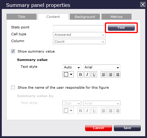
Content
The Content tab allows you select the type of call information you want to display in your summary panel.
Selecting a stats point
To choose the entity which the information in this summary panel should apply to, select a stats collection point, by clicking on the button.
A new window will open, allowing you to drill-down to the site or group level in the Directory, where the stats point object you want to add resides. To select the stats point, click on the  icon alongside it.
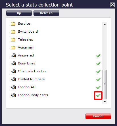
This will now appear as your chosen stats point.
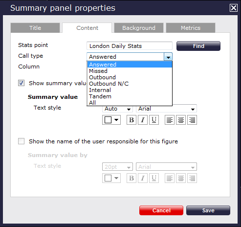
Selecting the call type
To select the type of call which the information displayed in this summary panel should apply to, click on the Call typedrop-down list and choose from the available options, as shown below:
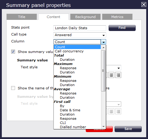
Selecting the information type
To select the type of call information you want to display in this summary panel, such as total duration, response time, etc., click on the Columndrop-down list and choose from the available options, as shown below:
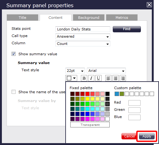
Show summary values
You may then choose to show only the summary values for this Summary panel and configure its properties. To choose the style of font or the font size, select from the drop-down list provided. To select the text colour, you need to click on the drop-down arrow. This will show the colour palette available. To select a standard colour, all you need to do is click on it. To add a custom colour, click on one of the blank custom colour squares and add the RGB colours to add to your custom palette. You need to click on thebutton to set the chosen colour.
If you would like the text to appear as bold, italic or underlined, simply click on the required box to highlight  . To determine the placement of your title, simply click on
  . At the end, click on thebutton to save any changes made.
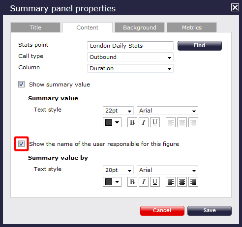
Show the name of the user
If you want to show the name of the user that meets the criteria set above, tick the box to allow this information to be displayed, then select the size, the type and the properties for the font you would like to use.
In the example below, we have selected to show the longest outbound call, so the Call type is Outbound, and Column is Maximum Duration. Ticking the box to display the name of the user meeting the criteria above, the summary panel will dispaly the call with the max duration and the name of the person that reach this threshold.
The summary panel of this last example will show as follows:

Background
Click on thetab to configure the properties for the background of your label panel.
If you would like to add an image source, simply type the details in the box provided, as shown in the sceenshot below, otherwise leave blank. You can decide to repeat the image or centre it on the panel, by selecting from the drop-down list of the Image style field.
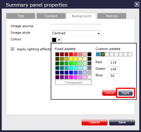
To select the background colour, click on the drop-down arrow; this will show the colour palette available. To select a standard colour, all you need to do is click on it. To add a custom colour, click on one of the blank custom colour squares and type in the RGB colour codes to add to your custom palette. You can also pick a transparent background, if you prefer. You will need to click on thebutton to set the chosen colour.
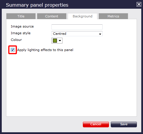
If you would like to apply lighting effects to the summary panel, tick the box provided, as shown below:
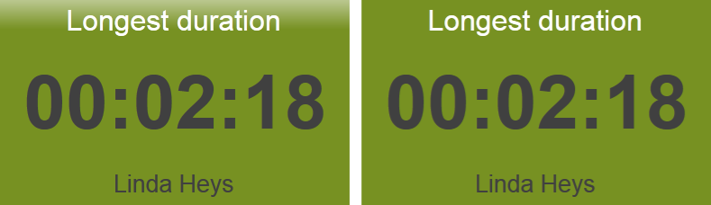
The two examples below show the difference between panels with and without lighting effects. The panel with the slight shine has a lighting effect applied, while the solid green panel hasn't:
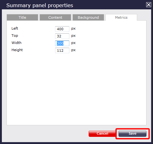
Metrics
To define the panel's metrics to suit your particular screen, type the required pixel sizes in the boxes provided, then click on thebutton to save any changes made.
Summary panel - overview video
For a live demonstration on how to design and customise a Summary panel, watch the video below: